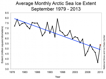
It’s getting cold again in the Arctic as the sun drops lower in the sky. But we’ve been through the time of most extreme ice loss, (mid-September), and this chart compares the current average September ice cover with other Septembers since the beginning of the satellite record. The key word is ‘average’, because those dots represent the average ice for the whole month of September, not the lowest ice for each September.
Because the ice rebounded so dramatically after last year’s record all-time meltdown, you’ll be hearing all sorts of spin from the denialist press about how the Arctic ice is “recovering”. Here’s the data. Look for yourself and make up your own mind.
From the NSIDC website
http://nsidc.org/arcticseaicenews/
