I usually publish Sea Ice Extent (SIE) data in this space, but this graph displays Sea Ice Volume, a more meaningful measure of the health of the Arctic Basin. Sea ice a centimeter thick looks just like meter-thick ice in an image. Since this parameter is not measured directly by sensor (it is modeled), I usually omit it as it is often attacked by denialists as unreliable. But I don’t think that is really an issue any more. When you consider volume, we can see that three quarters of the summer icecap has melted away in the last forty years.
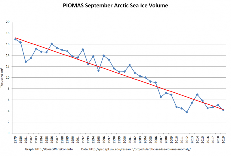
http://greatwhitecon.info/wp-content/uploads/2019/10/PIOMAS-Month-Sep-2019-768×520.png
For comparison, here is the same SIE time series graph I usually publish (see “September Summary”, below), but it is displayed with the Y-axis stretched to include the entire potential 1979 to zero range.
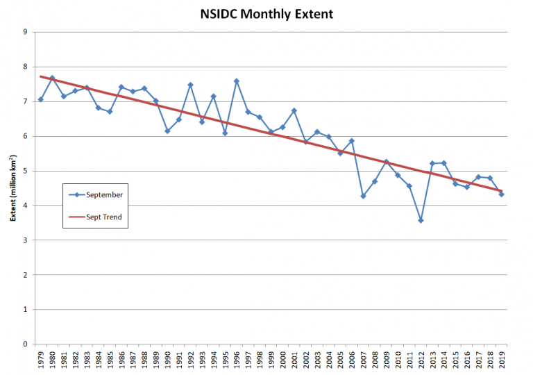
http://greatwhitecon.info/wp-content/uploads/2019/10/NSIDC-Month-Sep-2019-768×540.png
When graphically displaying data of this nature, it is common practice to diminish the range (Y-axis) to the values covered by the data in order to give a higher visual resolution of the trends. But it is also useful to graph time series so that the entire range of possible values is on the page. This allows us to form an instinctive picture as to the absolute range of the data, as opposed to just the relative range.
Greta is right, and she has every reason to be furious. So do I. So do all of us.