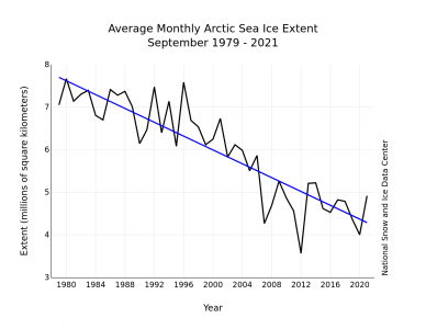
from nsidc.org
Arctic sea ice extent for September averaged 4.92 million square kilometers (1.90 million square miles), the twelfth lowest in the 43-year satellite record. This is 1.35 million square kilometers (521,000 square miles) above the record low set in September 2012, and 1.49 million square kilometers (575,000 square miles) below the 1981 to 2010 average. The last 15 years (2007 to 2021) have had the 15 lowest September extents in the record.
Mid-September is when Arctic sea ice reaches its summer minimum, and the September average is a good time to sample the ice and compare its extent with previous Septembers.
This year’s relatively modest Arctic Basin melt may encourage the denialists’ claim that Arctic sea ice is recovering. The gestalt of the chart should suggest otherwise. The data is noisy, but the overall trend is still down. But the question still remains; how, after the warmest year on record, could the melt only be in the 12 lowest? The answer lies in the way “Sea Ice Extent” is defined: SIE is not the total volume of ice on the water, it is the amount of water surface covered by at least 15% ice, This value is correlated with the total amount of ice present, but not highly correlated. It is chosen as a metric for climate change because it is directly measurable by satellite sensors (as opposed to modelled using questionable assumptions) and can be compared unambiguously to previous years’ measurements. There may be ice on the water, but no claim is made about how thick it is.
Keep your eye on the blue line, the linear regression (trend line) of the data. The linear regression is not just “drawn through” the data points by eyeball, it is calculated with an objective algorithm. The procedure is defined as follows:
A straight line is drawn through the data points in such a way that the sum of the square roots of the residuals for each year (the square of the difference between the actual data point and the value of the regression line AT THAT POINT) is minimized. This so-called root-mean-square (RMS) error is made as small as possible so that the line represents the moving average of the noisy data as objectively as possible. This is called a linear regression because the trend curve is a straight line.
Other, higher order curves can be fitted through noisy data (trigonometic, polynomial, logarithmic, exponential, etc.), but with only 42 data points to work with these higher regressions are not statistically justified. Still, if you look at the graph, it does appear that the slope of the line has decreased substantially since about the year 2000. This implies that not only is the ice melting, but that it is melting faster now than it was in the past.
Unfortunately, if we wait long enough to accumulate sufficient data points to do that, we may run out of ice altogether.