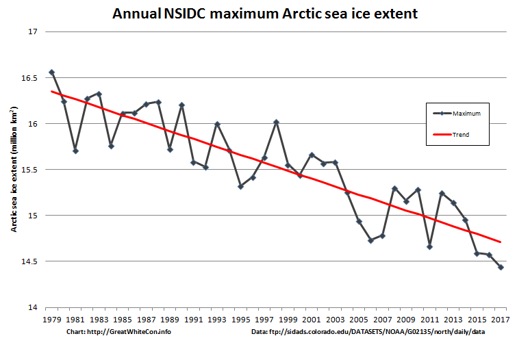
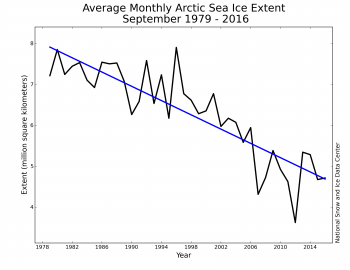
The Sea Ice Extent graphs I publish here graph the average SIE for each month. In early April I will publish the one that shows the average SIE for March (the month of maximum winter ice coverage) compared to previous March averages since the satellite era began in 1979. This chart compares the absolute maximum SIE on the day it topped out, compared to other high ice maxes since 1979. Either way, in March, as in every other month of the year, the trend is for the ice to disappear. Its not quite as extreme an effect in winter as it is in summer. The winter SIE ice loss has been about 13% in the last 40 years. The summer losses have been about 13% per decade.
http://greatwhitecon.info/wp-content/uploads/2017/02/NSIDC-Max-2017.png

For comparison, the summer (minimum) averages:
http://nsidc.org/arcticseaicenews/files/2016/10/monthly_ice_09_NH-350×270.png
